Neighborhood Mediation Center Rebranding
Neighborhood Mediation Center is a non-profit organization that seeks civility and resolution for all conflicts in Northern Nevada.
GOALS
When we were approached to redesign the Neighborhood Mediation Center logo, they were utilizing an outdated logo that had been around since the beginning of their organization. The client wanted to have a logo refresh that didn't stray too far from the original for brand recognition.
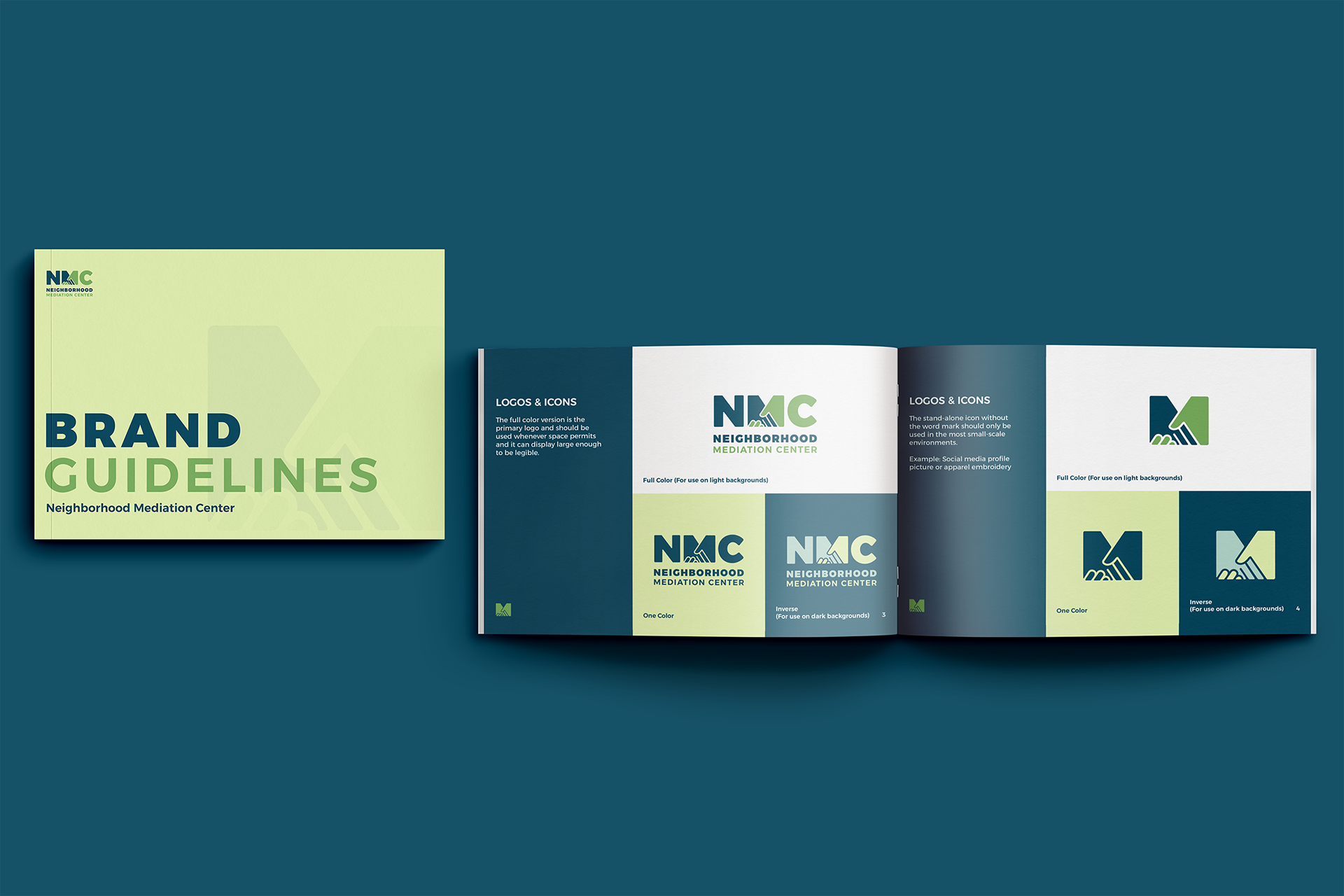
LOGO DESIGN
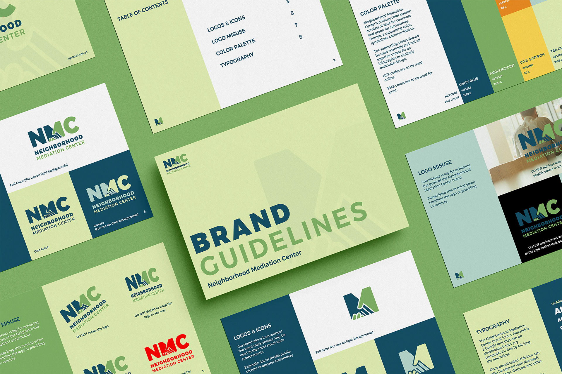
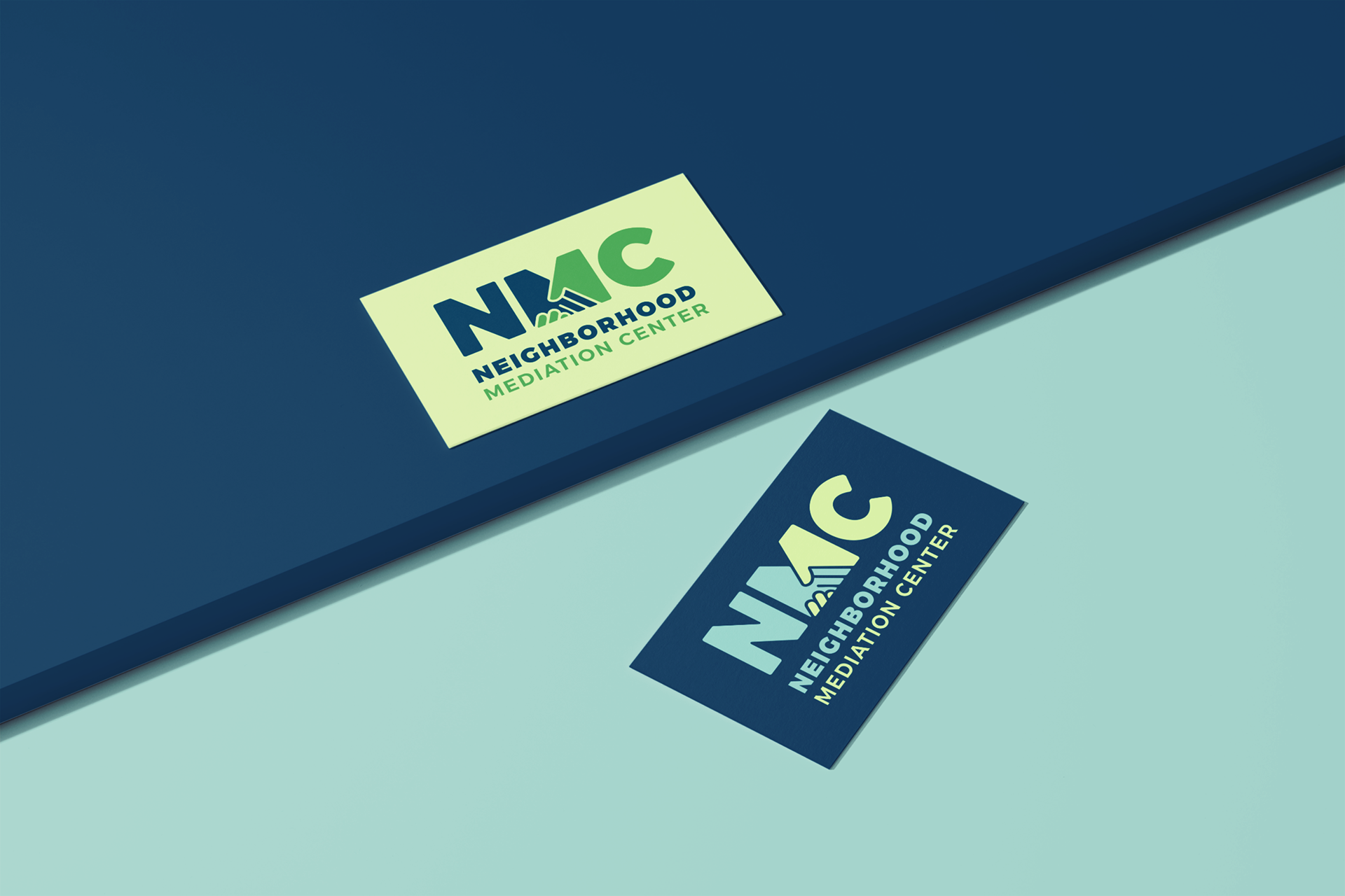
Neighborhood Mediation Center's refreshed logo is a modernized version of its previous logo. The "M" in "NMC" is consisted of a blocky handshake to symbolize conflict resolution. Neighborhood Mediation Center decorates the bottom of the logo in blocky, san-serif text.
Colors
Neighborhood Mediation Center’s primary color palette consists of blue for calmness and green for community. Orange, a supporting color, symbolizes communication.
*Project done with Estipona Group