Blend Catering Brand Refresh
Brand strategy and identity refresh for Reno Tahoe-based catering company, Blend Catering.
PAIN POINTS
When Blend Catering approached us, they felt disconnected from their existing brand. They had naturally outgrown their logo, which no longer reflected the direction they wanted to go. Clients also frequently expressed confusion around pricing.
GOALS
Blend Catering was looking for a brand refresh that captured their shift toward a more upscale, minimal aesthetic. Their overarching goal was to attract higher-ticket bookings. Committed to innovation, they wanted a new logo that reflected this unique, forward-thinking identity.
OUTCOMES & RESULTS
• Increase in social media engagement and website visits, resulting in a 100% booking rate for the 2023 fiscal year.
• 50% increase in high-ticket client bookings.
• Reported reduced sticker shock during client consultations, improving pricing transparency and client trust.
SKILLS
Illustrator, InDesign, Photoshop, Brand Strategy, Brand Identity, Menu Design, Print Design, Copywriting
*Project done with Muse Group Marketing
STRATEGY + BRAINSTORMING
• Who it's for: upscale couples, foodies, high-income individuals, executive managers
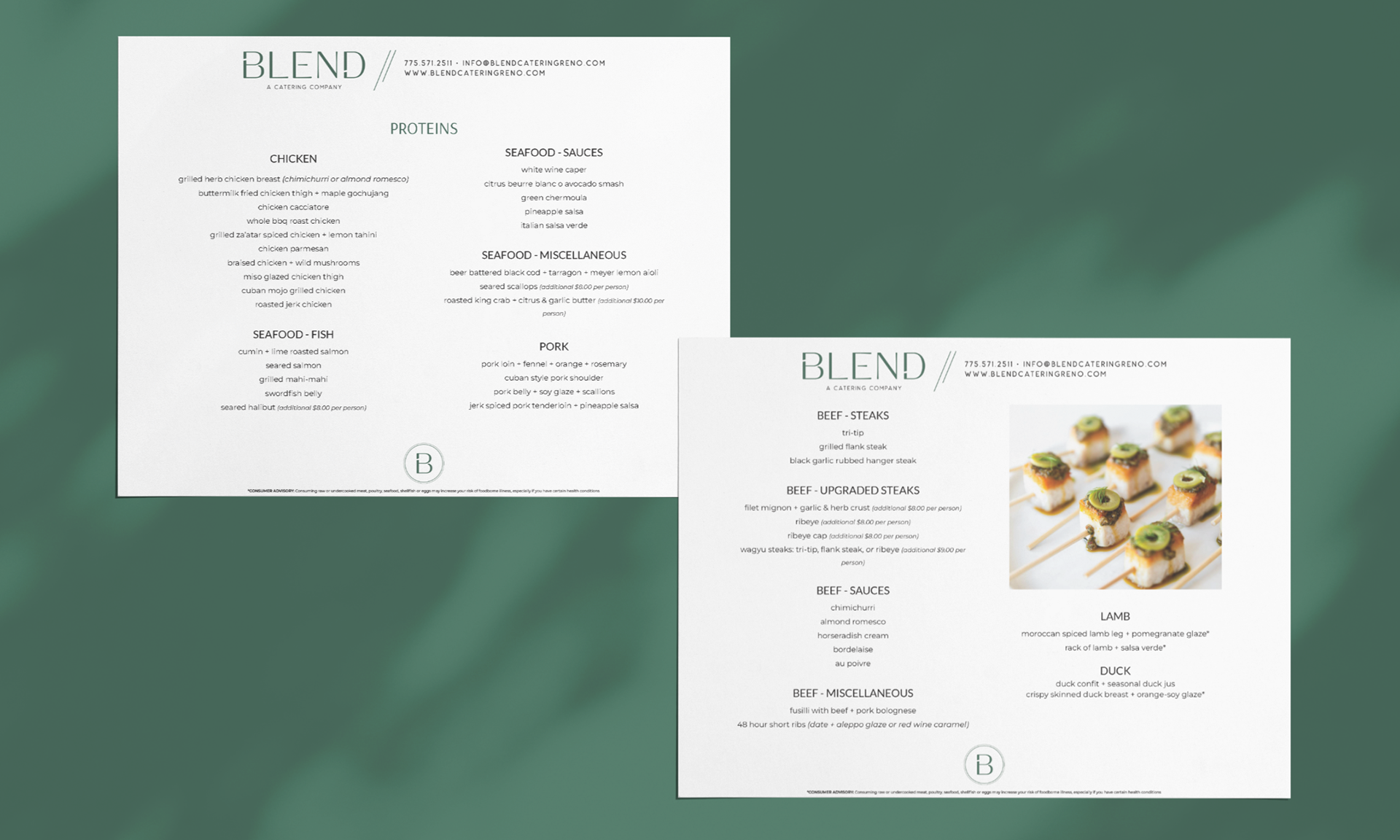
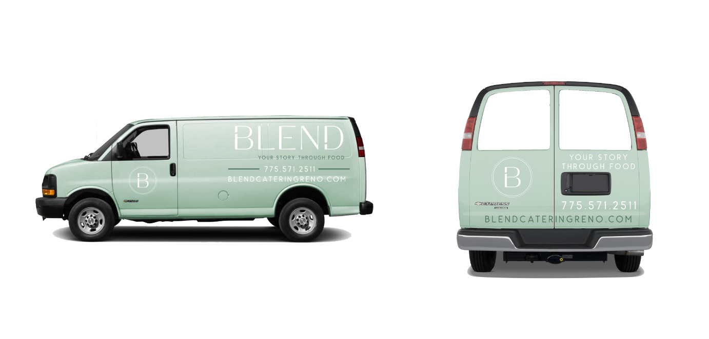
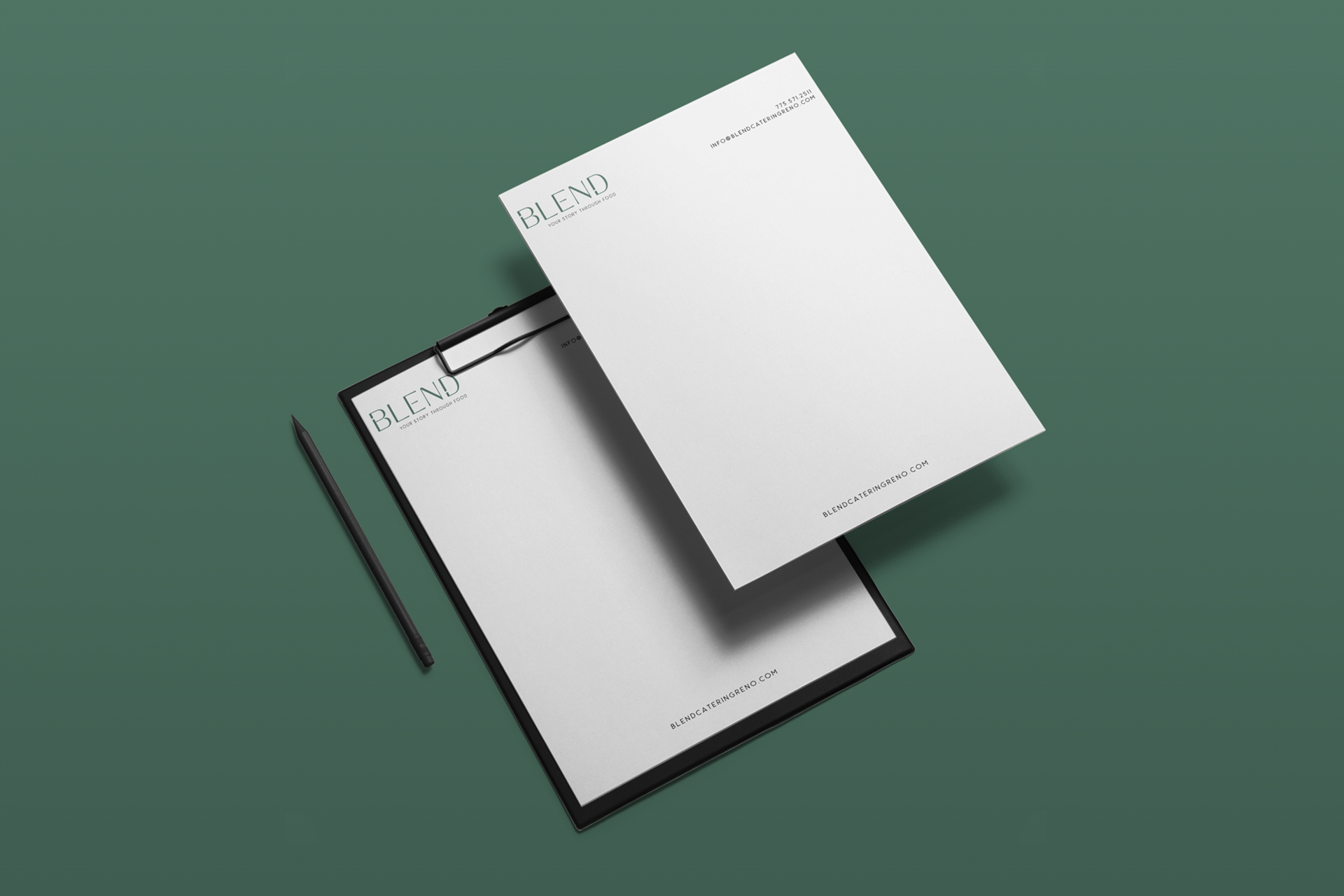
• Where it will be used: social media, menu design, van wraps, website, letterheads, aprons
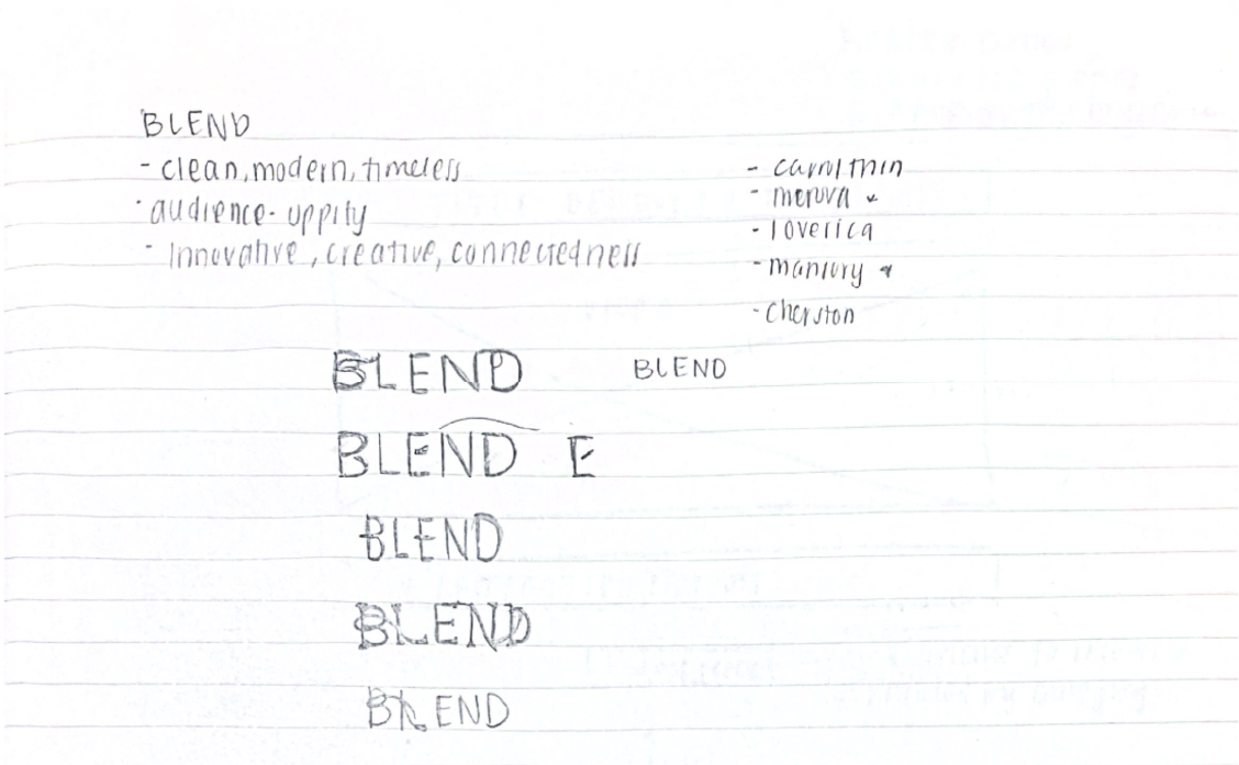
• Key brand words: innovative, creative, connectedness
Initial sketches and research involved looking up timeless, minimal brands. I noticed many of these brands used wordmark logos, focusing on typography.
I explored options where sans-serif and serif typography would be front and center, and how we could manipulate the text to focus on the goal of "innovation."
Design Strategy
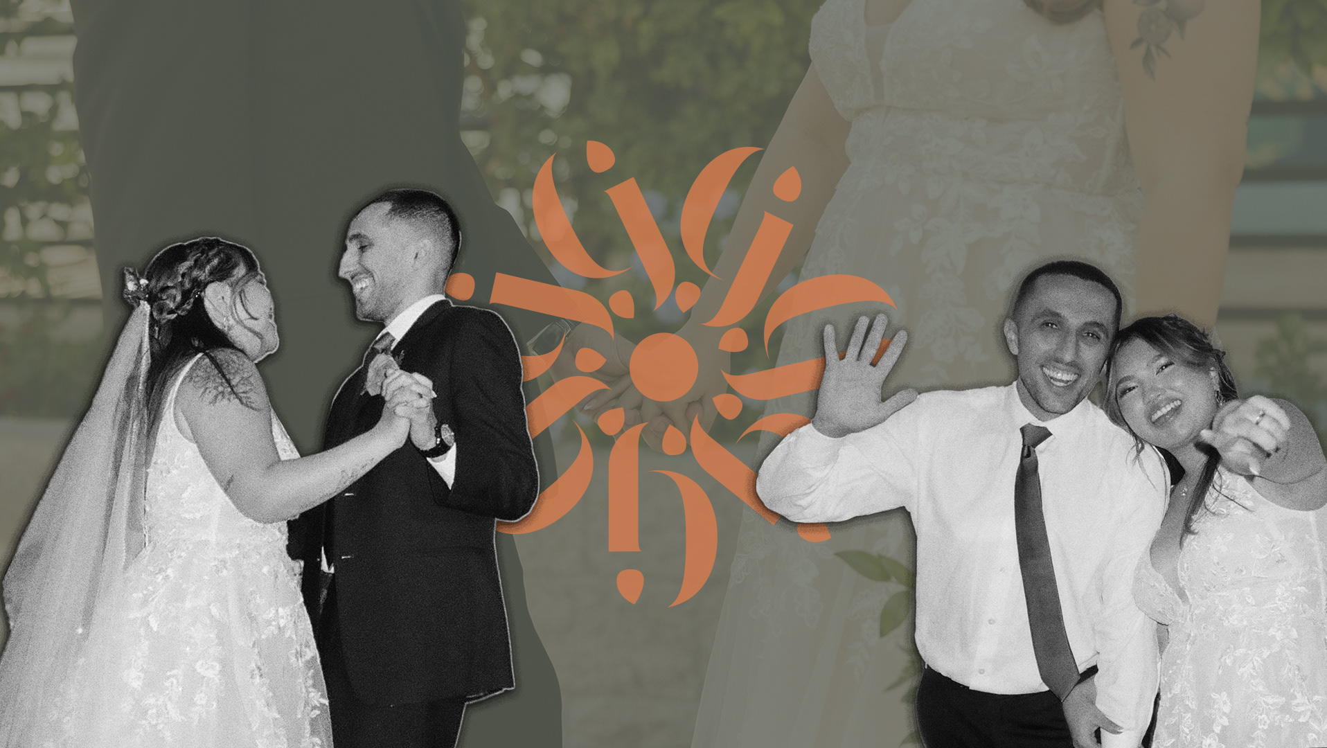
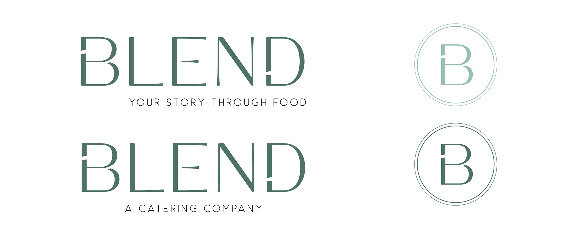
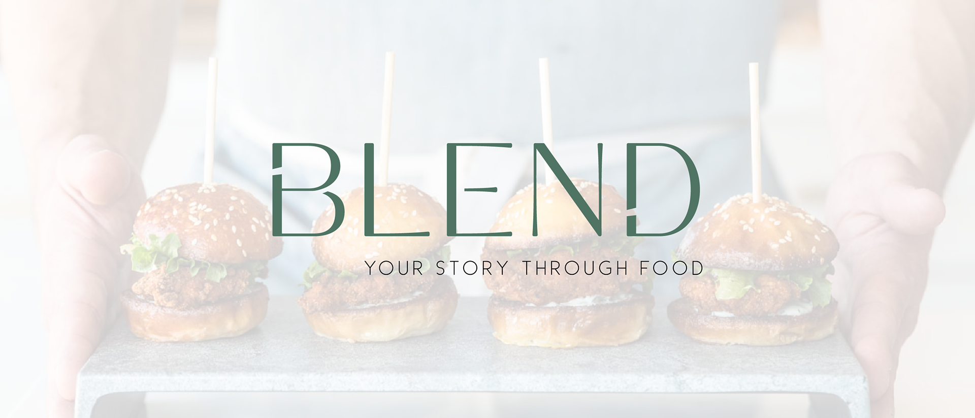
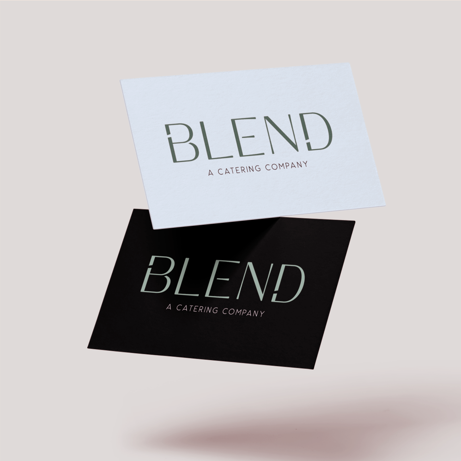
• Logo: The culture at Blend embraces unconventionality and harbors creativity. A slight gap to the “E” represents the constant desire to be different. The gaps between the“B” and “D” represent innovation. A simple, minimalist option.
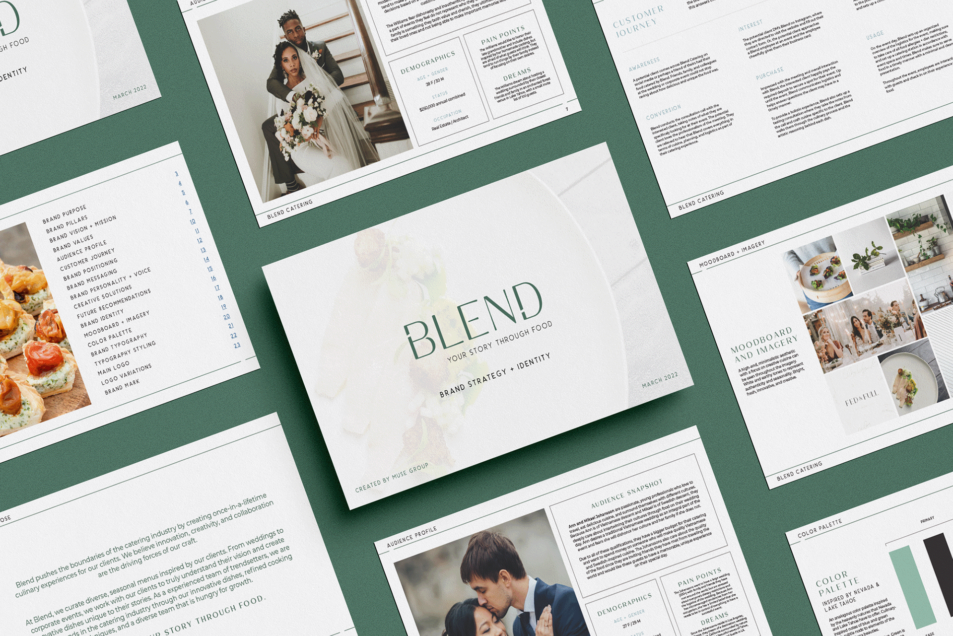
• Moodboard + Imagery: A high-end, minimalistic aesthetic with a focus on creative cuisine can be seen throughout the imagery. White and earthy tones represent authenticity and seasonality. Bright, fresh, innovative, and creative.
• Color Palette: An analogous color palette inspired by the heavenly natures that Nevada and Lake Tahoe have to offer. Culinary-inspired notes of blue and green with subtle nods to elements of the northern Sierra beauties. Blue is the color of innovation. Green is the color of creativity.
MISSION STATEMENT
Blend pushes the boundaries of the catering industry by creating once-in-a-lifetime culinary experiences for our clients.
We believe innovation, creativity, and collaboration are the driving forces of our craft.
BRAND POSITIONING
Blend Catering is a wedding and event catering company for passionate, entrepreneurial food lovers. We give clients the benefits of a diverse and expansive menu that accurately represents them and cuisine that pushes the boundaries of modern catering trends.
We do this through integrity-driven customer service and organized logistics, unlike other food catering companies with limited menus, traditional dishes, and one-dimensional options