FilExcellence Branding
FilExcellence is a non-profit that connects Filipinos worldwide through mentorship, community networking, and global resources.
pain points
When FilExcellence approached me, they were feeling disconnected from their current brand. Because it was made quickly on Canva, they felt like they did not have a distinct, unique brand or logo that truly encapsulated what they do as an organization.
GOALS
Our goal was to create a unique logo that did not use the standard Filipino flag colors or elements, instead connecting modern and pre-colonial Filipino culture.
OUTCOMES & RESULTS
• 100% increase in brand cohesiveness and perception.
• 35% increase in social media engagement, resulting in 2x more signups for their bi-annual mentorship program.
SKILLS
Illustrator, Brand Strategy, Brand Identity, Canva, Copywriting
strategy + brainstorming
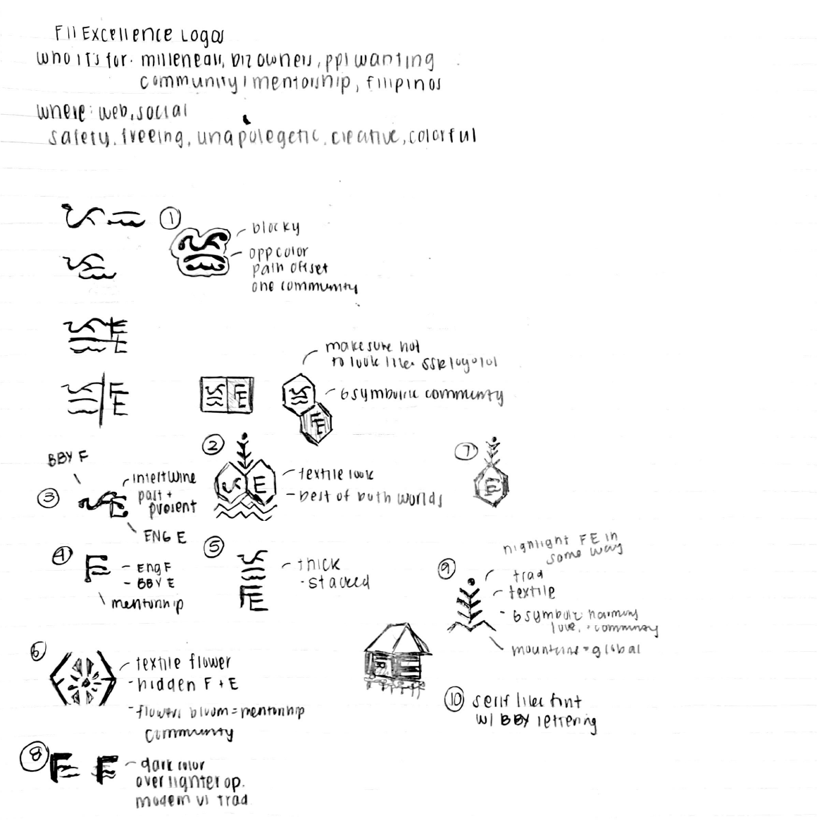
• Who it's for: millennials, business owners, Filipinos wanting community & mentorship
• Where it will be used: social media, presentation decks, emails
• Key brand words: safe, freeing, unapologetic, creative, colorful
Initial sketches involved researching traditional Filipino tribal patterns and textile patterns. Options 1 and 4 used traditional Babayin language, while Options 2, 3, and 6 explored options with tribal tattoo/textile patterns.
Overall, I wanted to incorporate the Babayin language into the final logo, as it is the ancient and traditional Filipino language. This would help achieve FilExcellence's goal of connecting pre-colonial and modern Filipino culture.
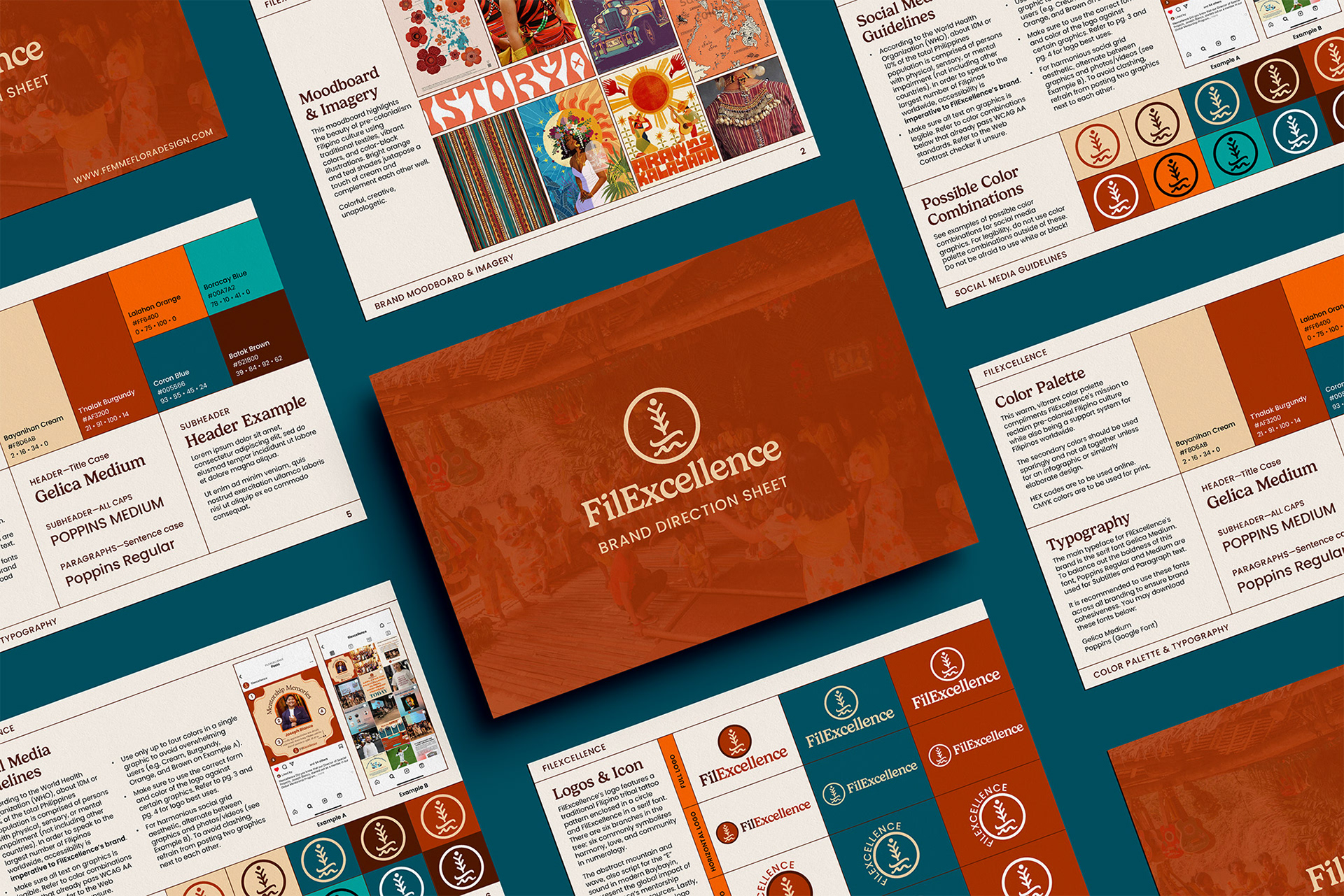
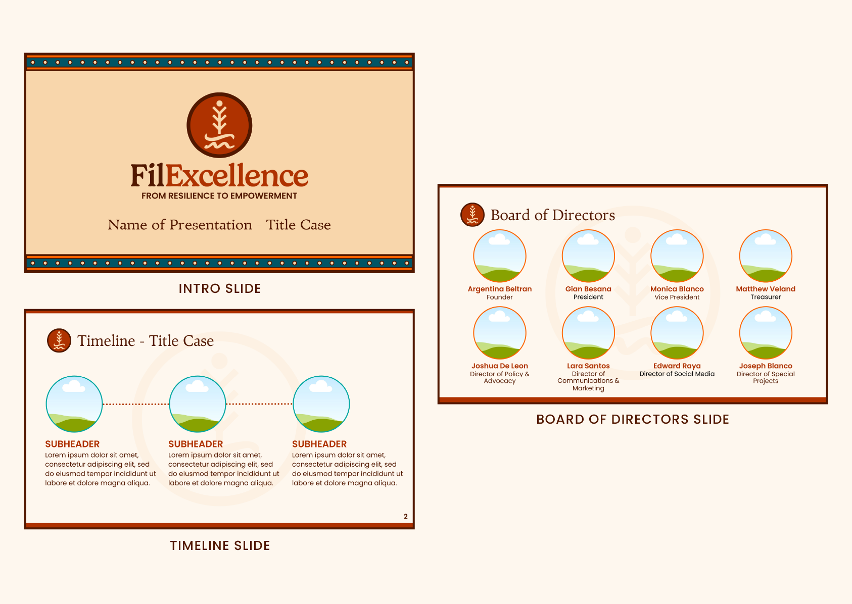
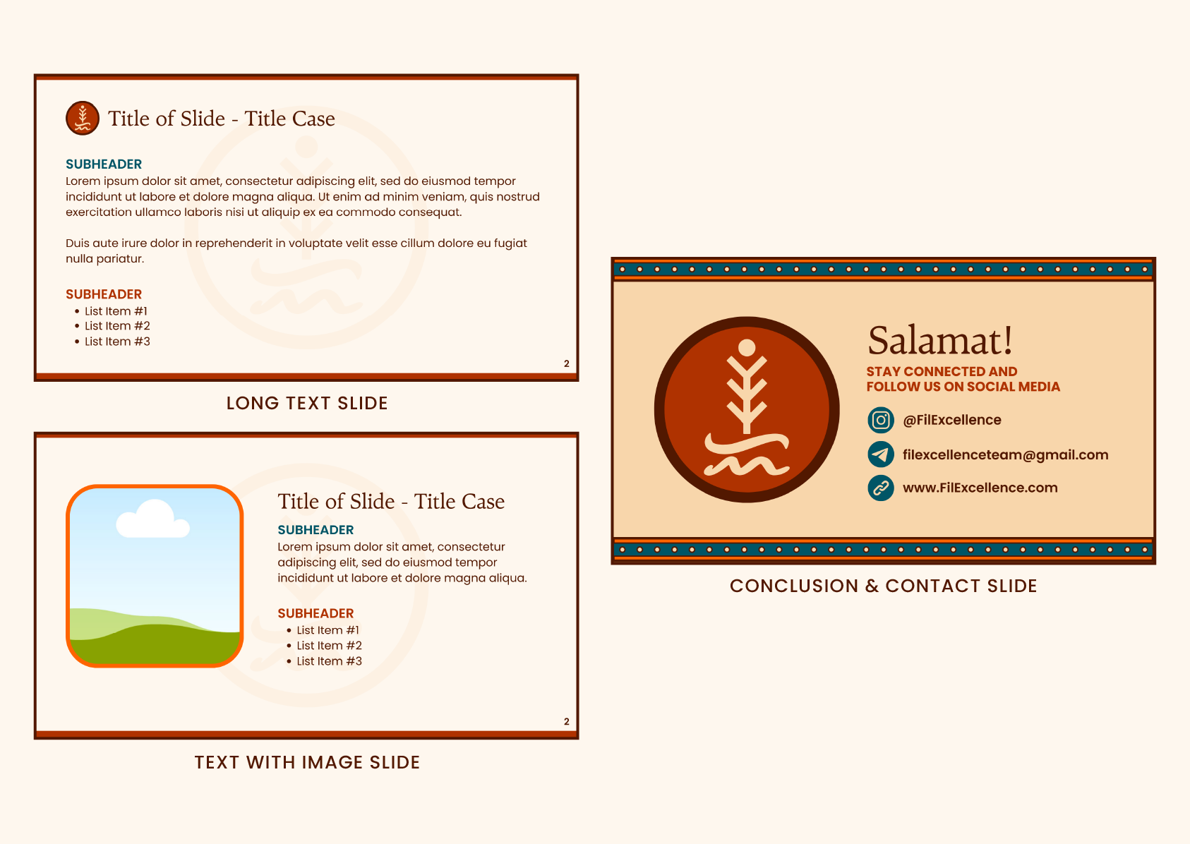
LOGO DESIGN
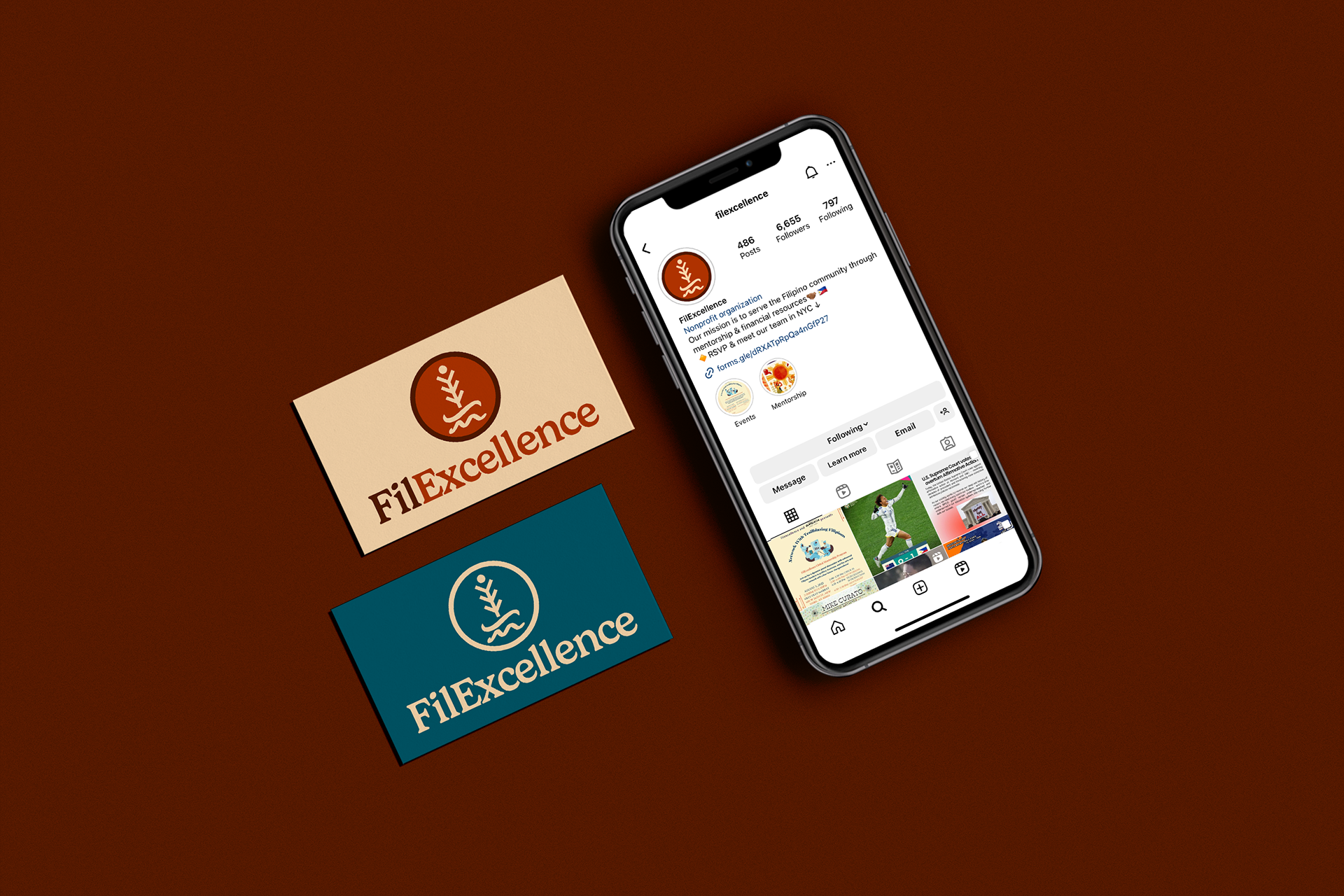
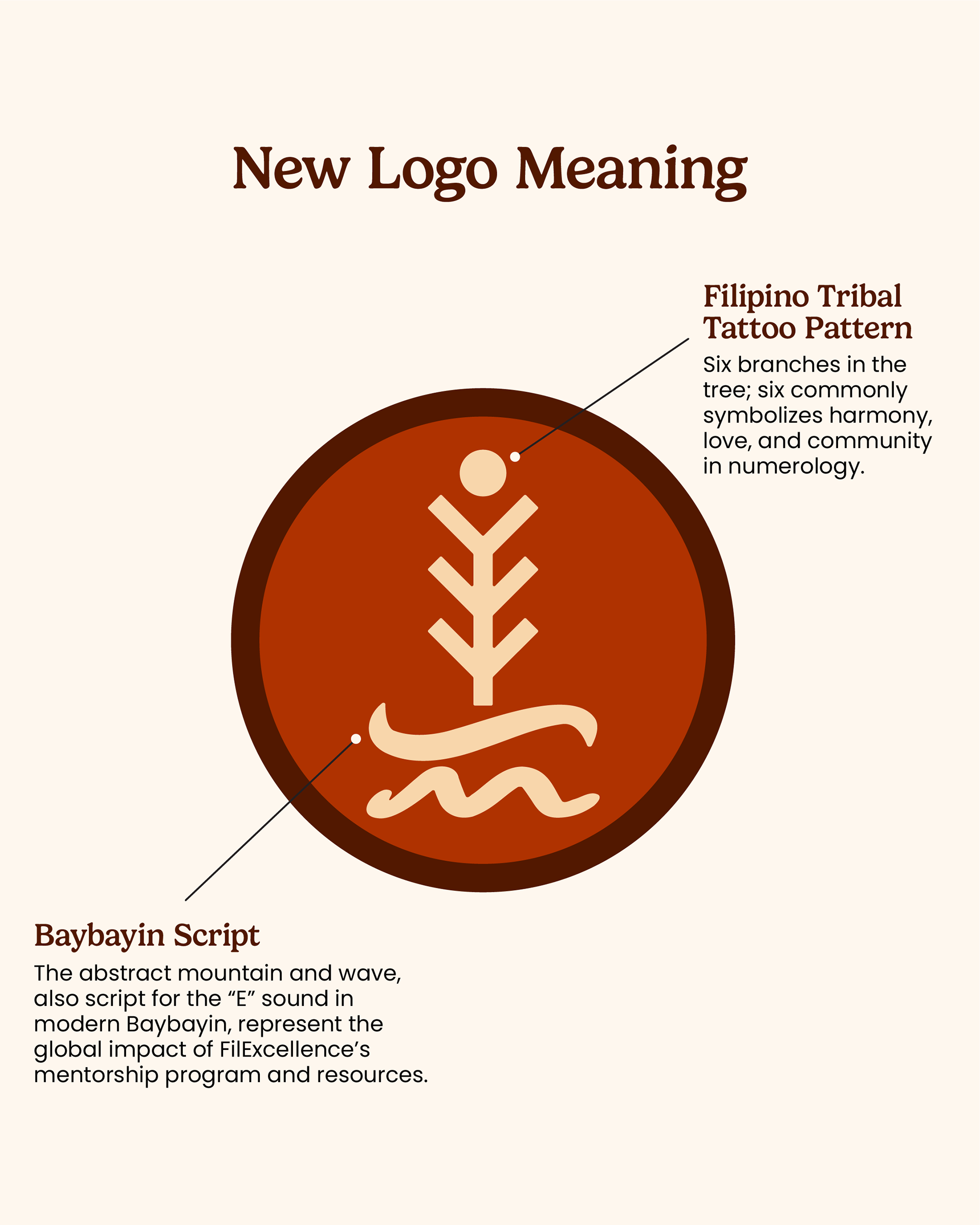
Because FilExcellence's goal was to connect pre-colonial and modern Filipino culture, I created a logo that features a traditional Filipino tribal tattoo pattern enclosed in a circle and FilExcellence in a serif font.
There are six branches in the tree; six is a commonly symbolized number in numerology, representing harmony, love, and community.
The abstract mountain and wave, as well as the script for the “E” sound in modern Baybayin, represent the global impact of FilExcellence’s mentorship program and resources.
Lastly, the “ex” and “ce” in the logo overlap to represent community and connection.
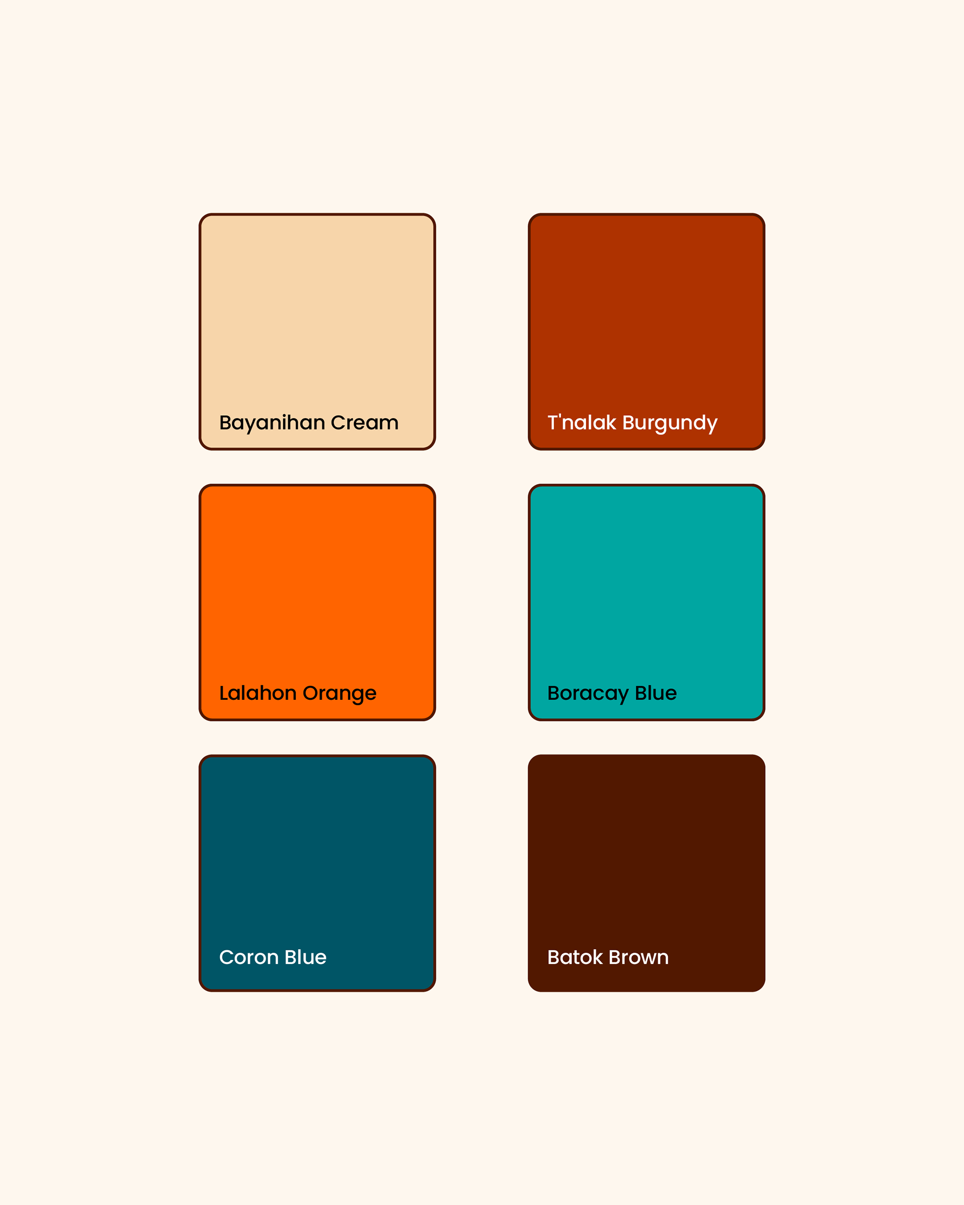
Colors
I opted for this warm, vibrant color palette because FilExcellence wanted to steer away from traditional Filipino colors (red, yellow, blue) to differentiate them from other Filipino non-profits.
I drew inspiration from the bold patterns of Filipino textiles, traditional clothing, and the iconic, colorful Jeepney.
• Bayanihan: A traditional system of mutual assistance in which the members of a community work together to accomplish a difficult task.
• T'nalak: A traditional woven fabric produced by the T'boli people of South Cotabato, Philippines.
• Lalahon: A mythical diwata found in ancient Visayan folktales and written myths.
• Boracay: An island in the Western Visayas region, known for its perfect blue ocean water.
• Coron: A municipal city in Palawan, a globally renowned destination for scuba diving.
• Batok: Traditional tattooing practices among Indigenous Filipinos.