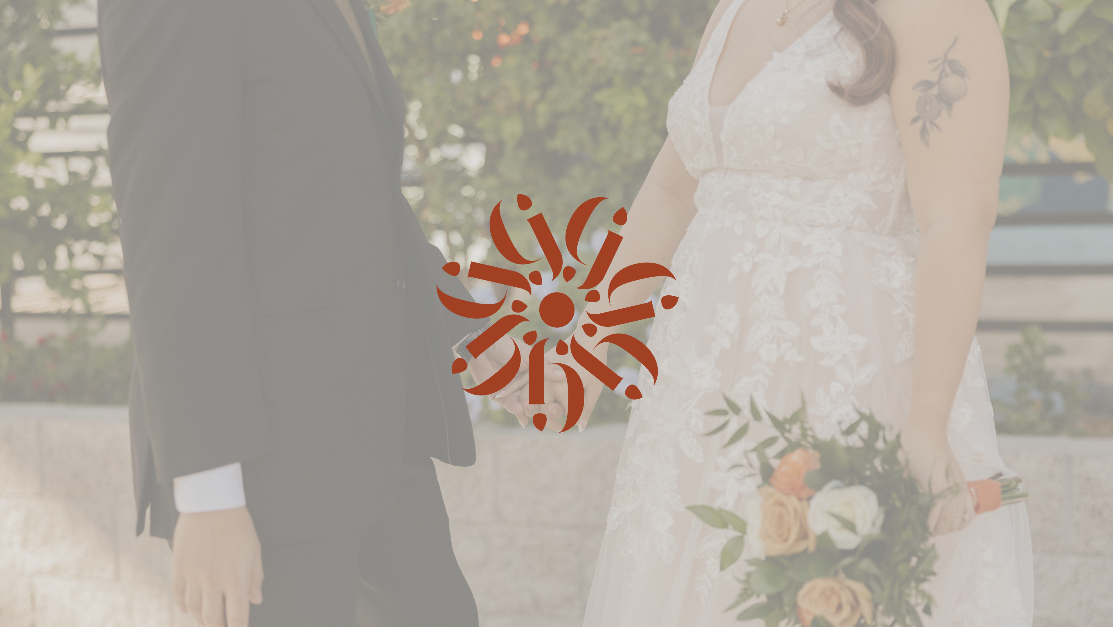
Blend Catering Pop-Up Series
A pop-up series dedicated to sharing global cuisines and fostering community amidst the COVID-19 pandemic.
PAIN POINTS
Due to the COVID-19 pandemic, Blend Catering experienced a decline in wedding bookings. They approached Muse Group wanting to create a series of events that allowed them to share food with the community while adhering to social distancing guidelines.
GOALS
The purpose of Blend Catering’s pop-ups was to introduce the Reno community to the cuisine of different cultures. With this in mind, I wanted to celebrate this in every design.
Overall, this project not only introduced me to different cultural art styles but also made me appreciate the intricacy and history of each of them as well.
SKILLS
Illustrator, Social Media Graphics, Print Design
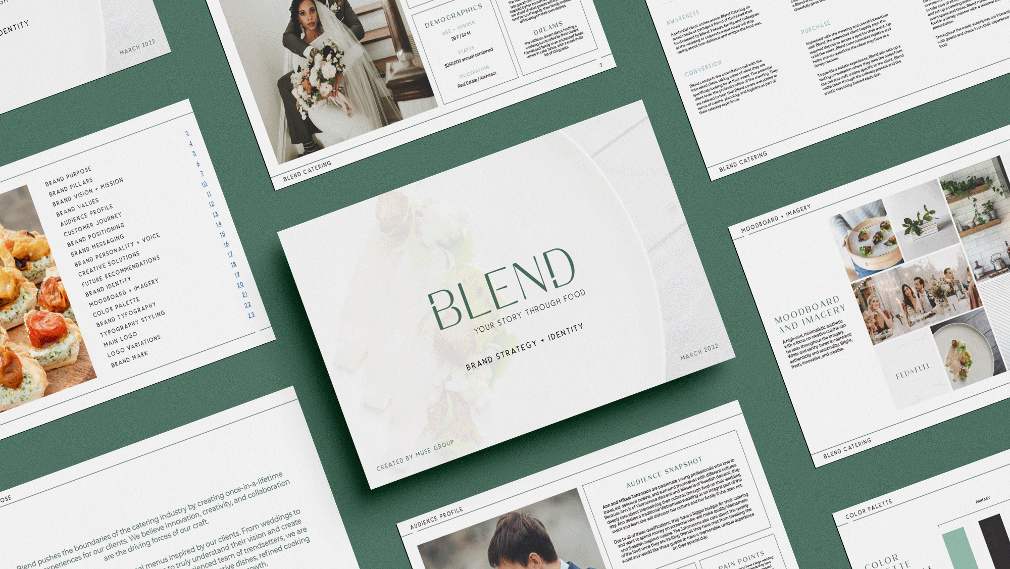
*Project done with Muse Group Marketing.
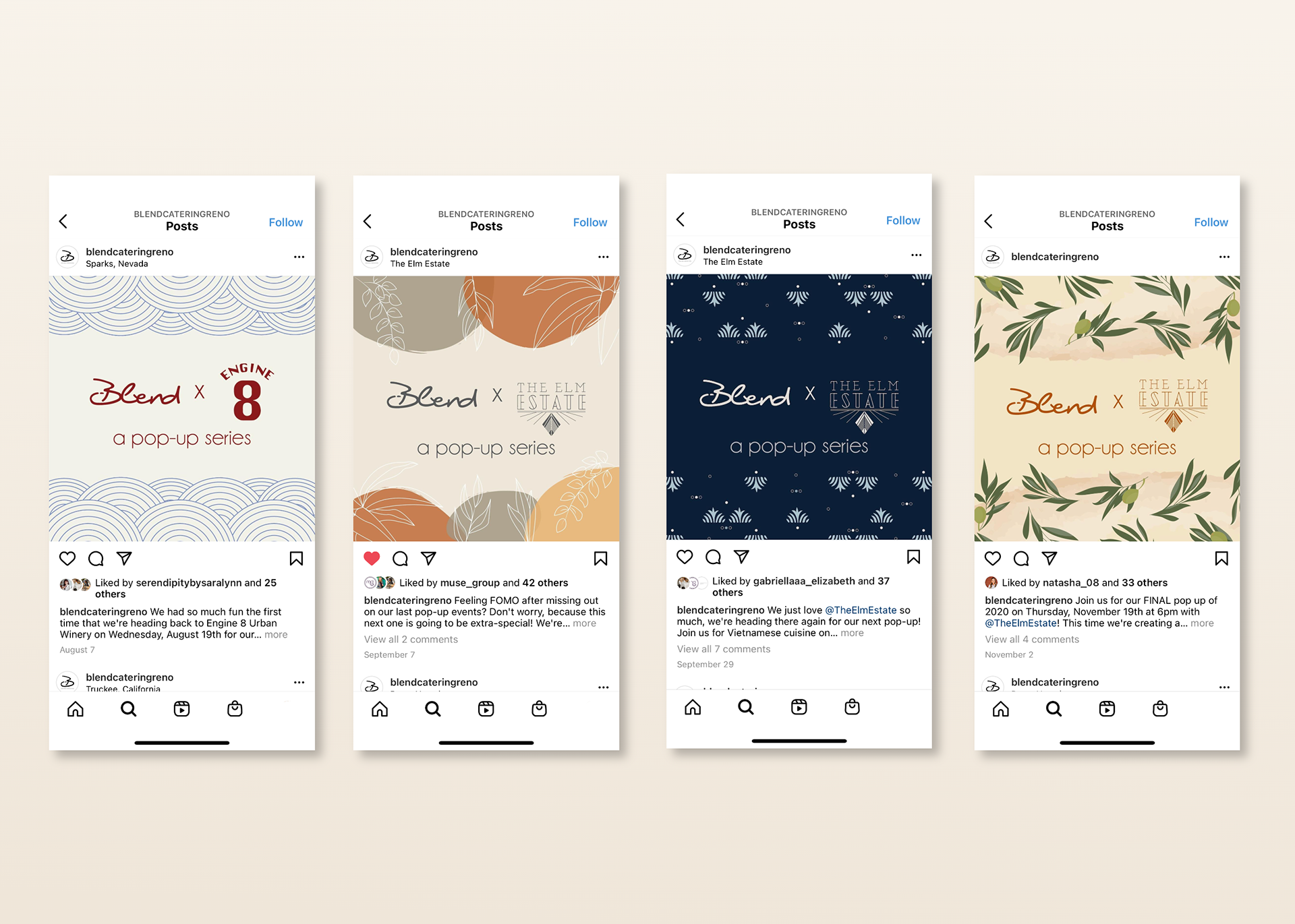
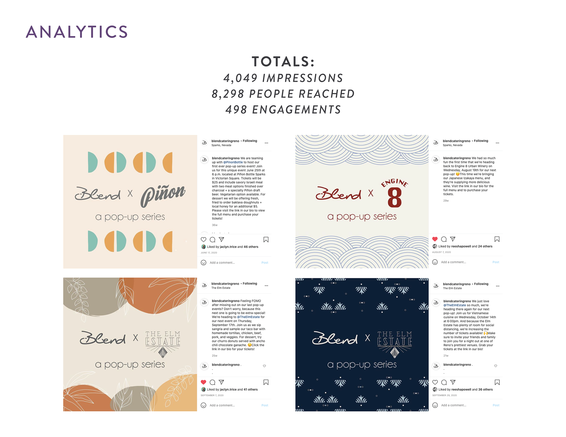
JAPANESE
The Japanese pop-up graphic was inspired by the famous ukiyo-e piece “The Great Wave Of Kanagawa.” This contemporary, iconic piece of art is popular in Japanese culture and Western culture.
LATIN-AMERICAN
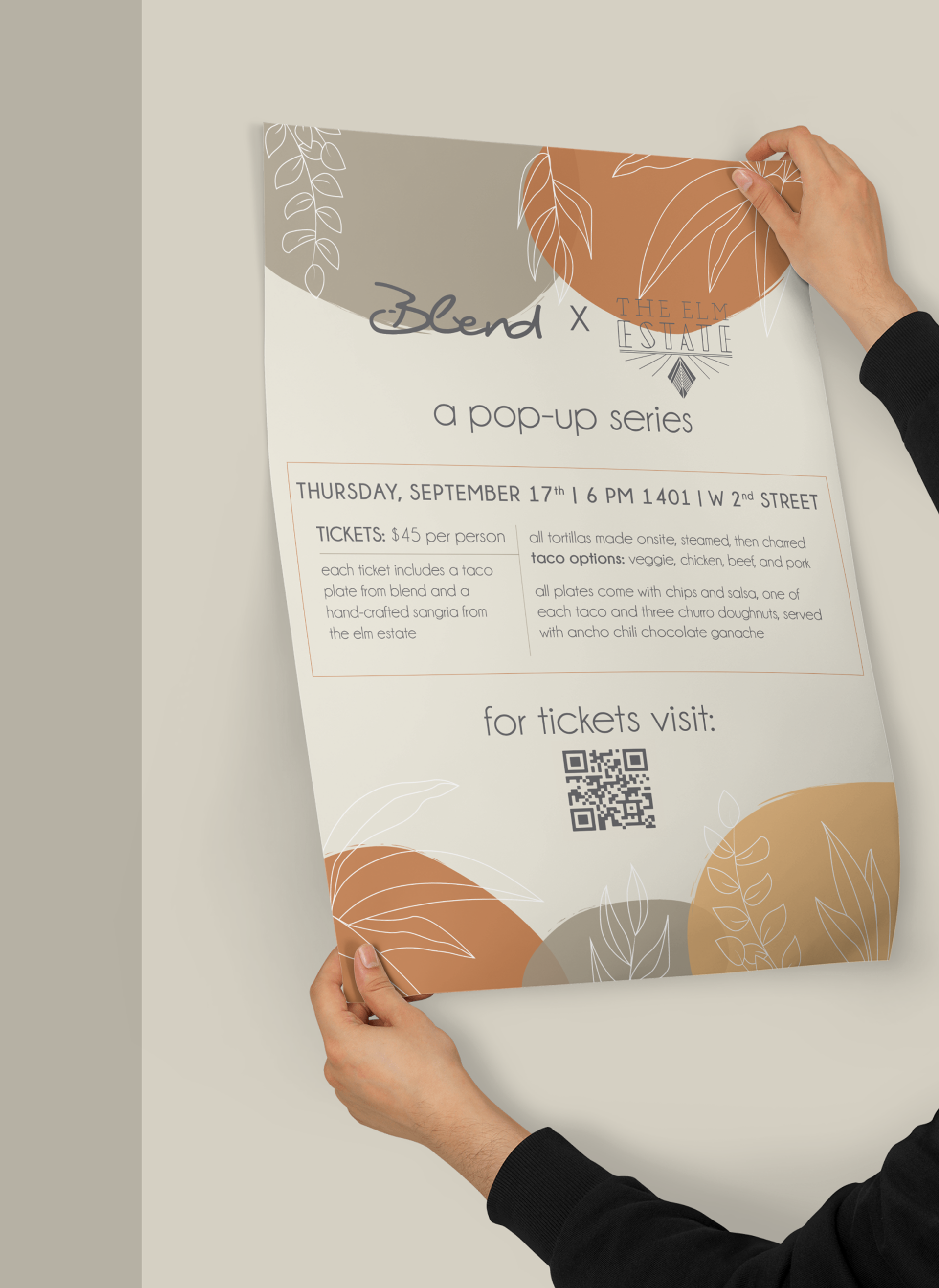
The Hispanic pop-up graphic was inspired by the warm colors of Hispanic culture and the tropical plants that hail from that region.
VIETNAMESE
The Vietnamese pop-up graphic was inspired by its national traditional dress, the ao dai. The attention to detail resembles a fine pattern found on this piece of clothing.
ITALIAN
The Italian pop-up graphic was inspired by the Italian region, Tuscany. The warm colors resemble the beautiful, warm landscapes of the region while including olive plants, a staple of Italian culture.
OUTCOMES & RESULTS
Through our communication efforts, Blend Catering was able to generate revenue and new business for 2021.
• The pop-up events raised a total of $15,500, which helped support Blend and its local partners.
• Blend generated 25 new leads for the 2021 wedding and event season.
• Our team consistently boosted ticket sales to 65 spots, with many attendees even purchasing tickets on the day of the event.